Stu News Laguna Marrie Stone4/8/22

POW!: Jean Lowe’s Your Place in the Multiverse aims to make audiences laugh while hitting them with some hard truths about American culture

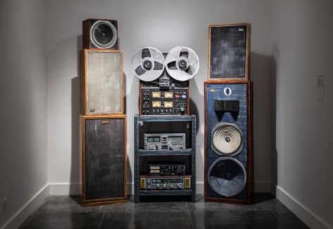
Hidden in the back corner of Jean Lowe’s installation at the Laguna Art Museum – so concealed it’s easy to miss – is a piece entitled “Town Crier (Self Portrait as Analog).” The 86”x 79” acrylic and cardboard tower mimics an analog reel-to-reel sound system with multiple amplifiers. The audio system is something from the 1970s, meaning it’s dated and obsolete. It’s also silent.

“Town Crier” is a companion piece to “Garden Carpet,” which hangs at the opposite corner of the room. Painted on cloth mache, the 95” x 77” inch rug looks like a faithful representation of a traditional Heriz carpet.

The two parts of Lowe’s “self-portrait” are both a bit puzzling and wholly intentional. “If the carpet expresses my interest in craft, decoration and beauty, then the amp and reel-to-reel is about broadcasting ideas. That’s how I consider my job as an artist: craft on the one hand and content on the other,” Lowe said. “Do I ever question the efficacy of visual arts to stir up conversation? Yes, perhaps, given that ‘Town Crier’ is basically mute and vintage. But, ultimately, visual art is a language and really can be used to talk about anything – and provoking conversation is what I hope to do.” 

Your Place in the Multiverse stirs up plenty of conversation. The five-part installation – which occupies the entire lower floor of the Museum – tackles capitalism, consumerism, feminism, environmentalism, animal rights and the bizarre value we place on ephemera, all while making us laugh out loud (and offering free snacks!). 

“I use humor to grease the way for serious content, which probably won’t be immediately apparent,” Lowe said. “But as you move through the exhibition, you might start to get a few stab wounds while you’re laughing.”

In addition to her full-scale carpets and elaborate sound system, Lowe creates room-sized furniture installations out of papier-mâché, cardboard, cordwood armatures and enamel paint. Bookcases, a grand piano and even a humorous recreation of a Dollar Store shopping experience known as “Discount Barn” (complete with retail shelves and floor displays) are only part of the show. The exhibition includes samples of Lowe’s work over the past 17 years, showcasing several of her most important installations as well as some new work. 

Visitors enter the exhibition through “Discount Barn,” Lowe’s interpretation of America’s ubiquitous big box store. Think Walmart with a sarcastic twist. There’s a floor-to-ceiling display of a fictional product called “Tear Stains Be Gone.” The accompanying advertisement reminds us that, “Being human is hard, but it doesn’t have to look that way!” There are products to trim our waists and sculpt our abs sitting alongside boxes of sugar, Karo corn syrup, cookies and Coors Light. For every piece of merchandise that promises to make us look good is some high-calorie commodity that offers to make us feel good (at least temporarily).

“Discount Barn” offers an array of replicas of everyday consumer products, each one actually for sale

There’s a reason phrases like “retail therapy” and “comfort buys” have permeated our consumer culture. Shopping is seductive. It promises to cure our problems, or at least anesthetize our angst. ‘

“‘Discount Barn’ is an active retail environment,” Lowe said. Meaning the items are, in fact, for sale. Canned goods, almond cookies and “Tear Stains Be Gone” will each set you back $199. A six-pack of Coors Light is a bargain at $499. 

“It’s not about making bank,” said Lowe. “It’s about getting the viewer involved in the content of the show. One of the overall themes is how we assign value to stuff.” It’s also about how we express ourselves through the purchases we make. It’s a challenge to walk through the exhibit and not ponder, at least for a moment, whether it’s worth $199 to take home an artistic memento. And once you ask yourself the question, you’re complicit in Lowe’s artistic point. Zing! 

“It’s a critique of the consuming part of consumerism,” said Lowe. “To make that critique, I made a whole bunch of stuff that can be purchased, so there’s a lot of inner tension in the conflicting stuff going on.”

If you do decide to make a purchase (and several people have), an apron-clad associate sits at a sales booth, waiting to take your credit card. A facsimile of a boombox spews out loud and cheerful Muzak beside her. I initially mistook one of the sales associates, Emma Yervandyan, as a mannequin and part of the fabricated exhibit. Apparently, I wasn’t the first. “People often think I’m not real,” Yervandyan told me. “Almost every other person who comes in thinks I’m not real. When I look up, they get scared. I don’t think I look like papier-mâché. But it’s this environment. It’s such a surreal setting that you assume nothing’s real.” 

Look closely and notice even the fire extinguisher on the wall is a painted replica. 

POW! – “Portraits of Women”

In the room adjacent to “Discount Barn,” visitors will discover “POW! (Portraits of Women).” Or, Lowe told me, “The acronym could also be ‘Prisoners of War’ or a cartoon reference. But, really, it’s ‘Portraits of Women.’”

“Portraits of Women” contains seven temporary portraits, painted directly on the Museum’s wall, as a commentary on the depictions of women by modernist male painters

The Pepto-pink room contains seven portraits, each one hand painted onto the Museum’s wall. Even the frames around the portraits are painted on the wall, making each portrait ephemeral. Does that bother Lowe? Not at all. “That’s very much part of the purpose of this room. That’s what gives it power,” she said. “There are no souvenirs. That’s part of what drives my subject matter. Because I am attached to things, but I don’t like it. But I totally am attached to stuff.

“For ‘Portraits of Women,’ I specifically wanted to do a show that didn’t have any objects, didn’t have stuff that I collected. No merch. That was the idea,” Lowe said. “I was interested in thinking about depictions of women by modernist male painters [specifically Jackson Pollock, Pablo Picasso, Willem De Kooning and Francis Bacon] as these fierce, crazy hags. I went into the piece with that in mind. But spending time with each of the paintings, I came to appreciate the strength and power of how these ladies were depicted. It’s nice when I can surprise myself.”

The Baby Grand Piano

Lowe’s pièce de resistance is arguably the baby grand piano which takes up the majority of the central room. The 2006 piece is constructed from enamel, fiberglass, foamboard and cardboard. It sits on another of Lowe’s signature Heriz carpets, accompanied by a fabricated indoor houseplant.

Best of all, the lid is propped open and the soundboard is filled with snack-sized bags of Doritos, Cheetos, Fritos and cans of soda – all free for the taking. “A grand piano is an instrument that signals class and taste,” said Lowe. “Here I’ve reduced it to being a cooler serving chips and drinks. It’s high brought low, and the piano offers up immediate gratification as a snack dispenser. I actually built ‘Baby Grand’ to be able to hold ice and serve beverages cold.”

“Baby Grand,” which functions as a working ice chest to dispense free snacks, comments on objects we deem high-brow and valuable

Lowe has been heavily influenced by the decorative arts movement, especially from the 18th century. “The excessiveness seemed like a reasonable parallel to contemporary society. I’m very issue driven, so I like figuring out what period of decoration would make sense to carry a particular issue.” 

Lowe said she’s also been moved by Bernini’s sculptures because they draw you into the action. “Charles Ray sculptures do that too,” she said. “That’s why I like doing installations. I like the way an audience can interact with the pieces.” 

Lost Time

As if to punctuate her point on the arbitrary monetary value we assign to seemingly worthless things, Lowe presents an auction house of random ephemera. Old drivers’ licenses, an airsickness bag, an expired phonebook, doctors’ notes scribbled on yellow pads. What will people pay for old scraps of paper? In reality, quite a lot. Visit a few online auction websites to see for yourself. There’s good money in vintage postcards, old broadsides and handwritten letters. Lowe took it to the extreme and offered up some ridiculous (and, of course, humorous)…well…crap.

“Lost Time” features several pieces of ephemera scheduled for auction. It comments both on the passage of time and the random value we assign to seemingly worthless pieces of paper.

“It’s just kind of nonsense stuff, but here value has been ascribed or estimated and these items are all due to be on the chopping block,” said Lowe. “Objects like the phone book are things of the past. So, this installation is both about the passage of time and aging, as well as how we create and assign value.”

Bookshelf Prints

Don’t miss the small library that lies in an alcove near the back. Six separate display shelves house genres common in bookstores – “Women’s Health and Wellness,” “Nonfiction,” “Men’s Interest,” “Food and Wine,” “Reference” and “Motivation and Self Help.” Lowe has been creating faux book covers over the past 30 years. The combination of images and titles will give viewers a chuckle – and then make them squirm.

Bookshelf Prints” represents 30 years of making humorous book titles that comment on the pathos of contemporary American culture

Anxiety: The Unexploited Weight Loss Tool appears alongside Contemporary Genocide in Perspective. Irritable Bridal Syndrome sits next to Sugarmommy: How and Why. Draw your own conclusions about the cover art accompanying Achieve and Maintain a More Powerful Daydream. 

Move over to Motivation and Self-Help and you’ll find titles like Ignorance Means Never Having to Say You’re Sorry and Pharmaceutical Solutions to Loneliness (published by Pfizer). The Men’s Interest section includes Essays on Modesty and Hot Buttered Cop Porn. 

“I like the juxtaposition of image and text and employing humor in a provocative way to discuss social issues in a really circuitous fashion,” said Lowe. 

Last Call,” another series in the exhibit, consists of five paintings that represent pages, or covers, from catalogs for miscellaneous goods. Inspired by Dr. Leonard’s Health and Wellness catalog, Lowe found its inherent oddness difficult to satirize. It’s a humorous comment on our culture’s obsession with consumerism.

LAM’s newly appointed Curatorial Fellow Rochelle Steiner interviewed Lowe at the opening reception on March 19. Steiner said of the exhibition, “Jean’s art is funny, insightful and provocative. She asks us to examine what appear to be consumer products and familiar aspects from the world around us, only to realize that nothing is exactly as it seems. Each of her objects and installations are hand-crafted and she injected them with her unique – sometimes sardonic – wit. The more we look and read, the more we encounter Jean’s perspective on the strange, funny and sometimes sad ironies of the human condition.”

“Girl Boy” (2008) shows Lowe’s love of juxtaposing over-the-top rococo décor with over-the-top contemporary over-consumption

I’ve visited Lowe’s installation three times in the past few weeks, each time discovering something new. Taking time to read her ephemera pays dividends. There are many humorous gems buried in the text. She’s right, though, about suffering some stab wounds along the way. The humor hits hard because it’s filled with truths about human nature – our bottomless desires, our insatiable appetite for consumption, our casual mistreatment of others and our often cruel treatment of animals (be sure to visit the space beyond “Power of Women” for a dose of animal rights reality). 

There’s a title buried in Lowe’s “Food and Wine” bookshelf – The Battered Women’s Cookbook. The cover art is a crude color sketch of a tasty looking steak and potato meal with a glistening knife ready to cut into the meat. It might elicit a spontaneous laugh, but it soon leaves you feeling a little sick.

I asked Lowe about her humor and where it comes from. She simply responded: “Humor comes out of pathos.” Fortunately for Lowe, and unfortunate for the rest of us, the world serves up a bottomless supply of inspiration.

Your Place in the Multiverse will be on display at the Laguna Art Museum through September 18. For more information about the exhibit, ticket information and hours, visit the Museum’s website at www.lagunaartmuseum.org.

Los Angeles Times Carolina A. Miranda03/28/2019

Datebook: L.A. artist Steven Hull’s three-part show draws carnivals and seafaring

New shows around Los Angeles include one inspired by carnivals and exhibitions that draw from the African American experience...

Steven Hull, “Our Little Chapel by the Lake — The Transformation of Jesus Christ,” at Meliksetian Briggs.In his second solo installation at the gallery, Hull is presenting a three-part exhibition that includes a show of abstract paintings with a kinetic sculpture, figurative paintings and sculpture and a record release and performance (the latter of which will close out the show). The show continues to explore the themes — such as seafaring and the carnivalesque — for which Hull is well known...

Voyage LAFebruary 18, 2019

Check out Jenn Berger’s Artwork

Today we’d like to introduce you to Jenn Berger.


Every artist has a unique story. Can you briefly walk us through yours?
I started making art when I was twenty years old. I was in college at the time in New Orleans. I wanted to do a semester abroad and found a tiny art program on an island in Greece. I didn’t think it was for me at first since I was studying philosophy and it just hadn’t occurred to me that art was a possibility. I was walking home from school one day when I had an epiphany: “Why couldn’t I study art?” I went to the school in Greece and continued making art ever since.

Please tell us about your art.
My work is project-based, so it varies from one work to the next. One through line is portraiture since I often work from images of specific people and animals. I take the images from the internet or photograph subjects in person.

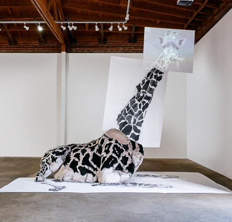
I have a collection of works where I combine video, drawing, and sculpture to form singular figures, such as that of a life-size giraffe, a giant standing cat, or Hillary Clinton as a child. For example, “Look At Me; Turn Around” combines video footage of a giraffe’s head, drawings of its neck and legs, and a three-dimensional fur-covered structure depicting the mid-section. These different modes of representation (video, drawing, and sculpture) combine into one cohesive form that simultaneously breaks apart when you consider it by each medium or element.

I also make “skinned” sculptures by attaching leather to an internal structure, recalling the process of taxidermy. “The Blob” is a 12-foot tall sculpture of an obese human-like form. Similar to the works mentioned above, this figure is both unified and fractal, with its limbs and torso fitting together like a doll and its piecemeal leather skin.

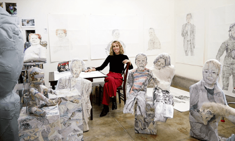
For about the past five years, I’ve been working on a series of drawn portraits based on strangers that I encounter. I photograph each person with my phone and then spend weeks drawing from their image. Since I’m working from digital prints and include an abundance of detail, I end up mixing digital noise from the image with marks on a subject’s skin. From afar, these drawings read as fully-formed subjects. If you get up close, though, and immersed in all the details, these figures start to fracture into bits.

As I’m making my work, I think about the relationship between an individual’s actual body (vulnerable to aging, illness, and death) and this detached self that exists independently online in images. Specifically, with the portraits of strangers, I wonder why we are drawn to one person over another, what we project about people based on their image, and this impossible sense that if you just look closely enough, you could see your way into the being of someone else.

Do you have any advice for other artists? Any lessons you wished you learned earlier?
I think the most important thing is to keep working. I plan to be working right up till the end.
When I’m struggling with something I’m making, I go back to something my friend said: “If it was easy, anyone could do it.”

For me, I wish I would learn to have faith in timing. When grants or residencies or shows haven’t worked out and then something comes together at a later date, it always ends up being the right time for it to happen. I want to keep that in mind!

How or where can people see your work? How can people support your work?
I’m currently in a group show at Elevator Mondays (near downtown LA) that’s on view till March 4th. I also have a website and Instagram, where I share my current work and upcoming shows.

Los Angeles Times Sculptors and painters pair up

Christopher Knight

Pairings” is an exhibition that teams six painters with six sculptors whose work is deemed somehow harmonious, like dinner entrees matched with compatible wines. The match might be conceptual or formal, although the link isn’t always clear.

At Denk Gallery, the three most compelling pairings tend to be formal.

Jenn Berger represents a gangly giraffe by starting on the floor with a drawing on paper of spotted limbs, moving up to a fully sculptural body made of fur stretched over chicken wire, segueing into a tall two-sided rendering on canvas of a very long neck and topping it all off — up near the ceiling — with a beguiling video portrait of the animal’s head, idly munching on leaves. Hanging nearby, colorful non-figurative canvases by Martin Durazo slip and slide among gestural, geometric, spattered, stenciled and stained applications of paint, each orchestrated into a seamless yet energetic whole.

More simply, organic shapes float through pictorial space in chromatically vivid paintings by HK Zamani, while Lana Duong lifts organic forms from the floor and suspends them from the rafters in actual space, in a two-part ceramic work and a hanging vinyl sculpture. Tribal symbols of an apparently fictional civilization crown chunky stoneware vessels by Kiel Johnson, and a culturally ambiguous, mythological red beast slithers through a swirling cascade of blue birds in a monumental diptych painted by Andrew Schoultz.

These pairings do succeed in nudging closer study to speculate on why they have been put together. Ultimately, though, assuming a viewer doesn’t already examine art is problematic. The process mostly feels like a parlor game that’s only occasionally amusing.

Also on view are painter-sculptor pairings by Carlos Beltran Arechiga and David Hendren; Mira Schnedler and Andre Woodward; as well as Chris Trueman and Michael O’Malley.

Los Angeles Times By Robert Abele

The Oscar-nominated shorts may have smaller running times, but the themes tackled are often big.

Of the live-action films, three explicitly dramatize real-life terror threats. Kevin Wilson Jr.'s dread-filled "My Nephew Emmett" — already a student Academy Award winner — follows the night in 1955 that Moses Wright (a heartbreaking L.B. Williams) lived through the abduction of his 14-year-old nephew Emmett Till by crazed racists. A continent away, Katja Benrath's "Watu Wote/All of Us" depicts Kenya's simmering distrust between Muslims and Christians as a bridgeable divide when the danger — in this case, a bus attack by terrorists — is existential.

Reed Van Dyk's naturalistic standout "DeKalb Elementary," meanwhile, painstakingly unfolds via tight framing and real-time editing an exchange between a single mother/temp secretary (Tarra Riggs, magnificent) and an armed, discontent interloper (Bo Mitchell). Inspired by a 911 call about an Atlanta school shooting, it's an unspooling marvel about the gift of empathy.

Communication is also central to the bittersweet emotions behind Chris Overton's effortlessly heart-tugging "The Silent Child," about a neglected deaf 5-year-old in a hearing, nonsigning family, and the uphill battle for a social worker (deaf advocate Rachel Shenton, who also wrote it) in drawing her out. Talking is no cure, however, for the dueling psychiatrists — one who's actually a delusional patient — in this batch's only comedy, Derin Seale's Pythonesque confection "The Eleven O'Clock."

Humor with sentiment usually rules the animated category, but this year, that's only exemplified by Pixar's "Lou," directed by Dave Mullins, which inventively imagines a schoolyard-bully problem solved by a crate full of lost and found items. A nastier wit pervades two others: the Roald Dahl adaptation "Revolting Rhymes," from filmmakers Jakob Schuh and Jan Lachauer, which turns the happy-ending plight of classic fairy tale characters (voiced by notable British actors from Dominic West to Rose Leslie) into an interlocking farce of crime and vengeance; and the ravishingly CG-textured, wordless, six-director French entry "Garden Party," whereby a wrecked, bullet-riddled mansion hosts a gathering of curious amphibians.

More delicately touching is the stop-motion "Negative Space" from Max Porter and Ru Kuwahata, which finds fanciful grace in a grieving man's memories about his father's relationship to, and lessons in, suitcase-packing. On the heavy-handed end lies the Kobe Bryant-written and narrated "Dear Basketball," directed by Glen Keane, a predictably soaring, sketch-animated reverie to boyhood dreams and career glory — scored by John Williams, no less — that thinks it's a slam dunk when it's a missed three-pointer.

Mindy Alper in the documentary short "Heaven Is a Traffic Jam on the 405."
Mindy Alper in the documentary short "Heaven Is a Traffic Jam on the 405." (ShortsTV)

The strong documentary nominees suggest that the world's cruelties have tough adversaries in kindness, caring and dedication. In Cleveland, ex-cons can learn French cooking and restaurant management through a training-to-work program depicted in Thomas Lennon's "Knife Skills," set at a French fine-dining establishment staffed by the newly released.

In the grim-yet-stirring "Heroin(e)," filmmaker Elaine McMillion Sheldon tackles the opioid epidemic in her overdose-devastated home state of West Virginia by chronicling the tireless frontline efforts of three tough, sympathetic women: a deputy fire chief who races from emergency to emergency, a firm-but-friendly drug court judge and a charity-driven lady who brings food to addicted prostitutes.

Illness and infirmity color two emotional tales. In "Edith+Eddie," director Laura Checkoway introduces us to interracial nonagenarians in love, whose late-in-life companionship is threatened by an impatient daughter and a callously applied guardianship. Frank Stiefel's "Heaven Is a Traffic Jam on the 405" offers an intensely moving portrait of 56-year-old Angeleno artist Mindy Alper, whose life is an ongoing struggle to balance depression and often debilitating mental disorder — including a decade without speaking — with a richly expressive talent (for drawing and sculpture) that thrillingly connects her soul to the world.

And ultimately, these docs ask, what is it that defines us? Things beyond our control, our pasts, or what we make of them? Kate Davis' "Traffic Stop" toggles between dashcam footage of an upstanding 26-year-old Austin, Texas, schoolteacher's terrifying experience with out-of-control racist cops, and her life since as she tries to not let the experience derail her from hard-won, everyday achievement and joy. "Traffic Stop" is a slice-of-life corrective to unwarranted internet notoriety, and like the best of these shorts, a compassionate inquiry into others, the movie equivalent of a concerned "How are you? Tell me what happened."

-------------

‘2018 Oscar Nominated Short Films’

Not rated

Running times: Live action program, 1 hour, 36 minutes; animated program: 54 minutes; documentary program: 3 hours, 2 minutes

Playing: In limited release

Los Angeles Times Christopher Knight03/21/2017

Review: A Klansman with a megaphone: Steven Hull’s sordid art laments troubled times

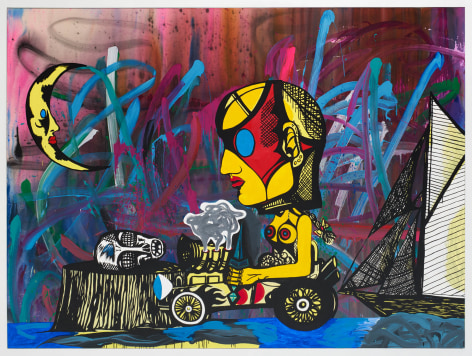
Steven Hull makes carnivalesque hybrids of painting and sculpture whose chief aim is to turn visions of the conventional world upside down. When that world has already been stood on its head, his art assumes an unexpected level of creepiness.

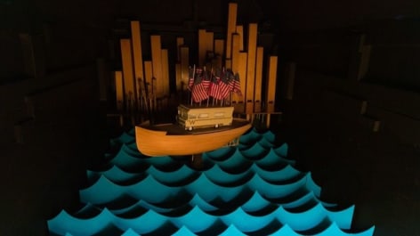
The centerpiece of his incisive show at Meliksetian Briggs, Hull’s debut with the gallery, puts white nationalism and its perversion of authentic Christian values on sordid display. An assemblage of ramshackle found objects, it features an old-fashioned motorized scooter — a vintage 1951 Electric Shopper — towing a model battleship that’s made from wood blocks, packing tubes and old sardine and tuna fish cans, all painted dull gray.

Painters' Table Jason Ramos07/2016

The Eyes Have It

Jason Ramos reviews the recent exhibition John Mills: For Your Eyes Only at Rosamund Felsen Gallery, Los Angeles.

Ramos writes: 

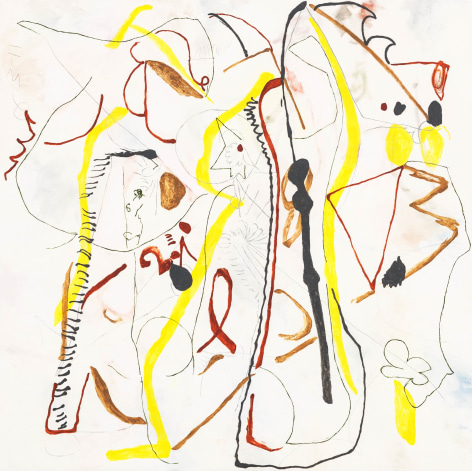
"For Your Eyes Only, John Mills’s newest solo exhibition at Rosamund Felsen Gallery, is not about the 12th James Bond film from 1981 starring Roger Moore as 007. But the title is a clue as to what parts of the viewers’ body should be prioritized when experiencing this current body of work. Mills’s second solo with the gallery has him continuing with the square format, the white-ish grounds, the modest-to-heroic scale, and a visual language inspired by early European abstraction. A surface critique might argue for some more bolder, declarative evolutionary changes from one exhibition to the next, but as pointed out in the title, these works aren’t for a viewer’s cynical, novelty-seeking lizard brain. These works are for your eyes, only, the eyes being the only part of our brain that is in actual physical contact with the world outside of our own heads.

Having staked his claim with his format, ground, scale and referents, Mills’s new work is free to juggle the possibilities and delights offered with painting’s phenomenological effects. Space is stacked, folded, stretched and warped; marks, dabs, and scribbles flow, writhe and repeat themselves as if moving through time. Elements in each composition obey a felt sense of optical logic, the edge of the canvases being the most influential formal element. In the larger works Ellipsis, Sign Language, and Formal Foilbles, dabs/blobs/circles/dots bounce off the frame like Pong, tracing their paths into another spatial dimension, never bouncing out of the frame. Underneath and around them in the background and on their level, more familiar Mills-esque elements follow the blobs’ lead. More than even his last exhibition, Mills’s work reads like transcriptions of consciousness, reactions to emerging visual structures in each painting, a result of their being based on smaller drawings. Flashes of identifiable imagery are now joined in equal measure with more direct visual sensations; in Birdcage, Off the Wall, and Mental Charms the picture plane is carved and contoured on top of distant, hazy, clouds of fluffy background. While the emergent imagery in his last solo, High on Signs, frequently took the shape of suggested faces, heads, leaves and feathers, here scribbled into the grounds are goofy cartoon character bits and pieces, comically floating around, as in the paintings Commune and the aforementioned Off the Wall, recalling somewhat the line and character of Far Side cartoonist Gary Larson.

Suggestive associations abound in all the paintings, perhaps the most visually poetic being Out There, a smaller work from 2015. Simple diamond shapes read like kites in the wind, completing a recurring motif of motion through time and space. This work along with the paintings titled Master Stack and Nature Crush inch up to referencing landscape imagery, yet another possibility offered by the broad range of the abstract square format, the ultimate modernist invention. Mills’s squares this time, however, rely less on their identification as revivals of modernist aesthetic than as accessible, sensitive meditations on the affecting presence of marks, dabs, lines, scribbles, doodles, smudges, shapes and other basic visual responses. They are in a closer arena of work that would include such masters of affecting simplicity as Richard Tuttle, Mary Heilman, and Robert Ryman, though with an eye towards the basic components of intuitive pictorial imagery that is reminiscent of the recent work of Laura Owens, David Lloyd, Chris Martin, and Torey Thornton."

Los Angeles Times The power of the doodle: John Mills' art opens a door and lets your imagination walk through


David Pagel

If doodles could hallucinate, they’d probably see images similar to those that flit into focus across the sensuous surfaces of John Mills’ new paintings.

At Rosamund Felsen Gallery, “For Your Eyes Only” consists of 15 small, medium and large canvases that the L.A. artist has dabbed with brushes and scratched with both ends of pencils, sometimes leaving graphite marks and at others incising lines into layers of paint that have not yet dried.

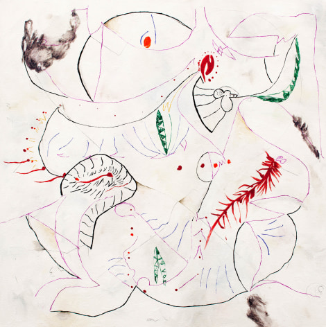
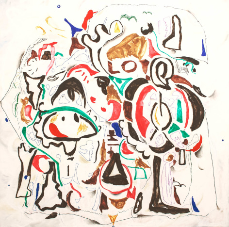
Each of Mills’ daydreamy paintings transforms the casual scribbles and meandering marks of doodles into a pleasurable romp that wends every which way and often ends with an explosive realization of the freedom to be had — and the wonders to be discovered — when you don’t where you’re going.

Aimlessness rarely looked better. Nor delivered more consequential results.

...

ArtScene Recommendation by Jody Zellen

By Jody Zellen


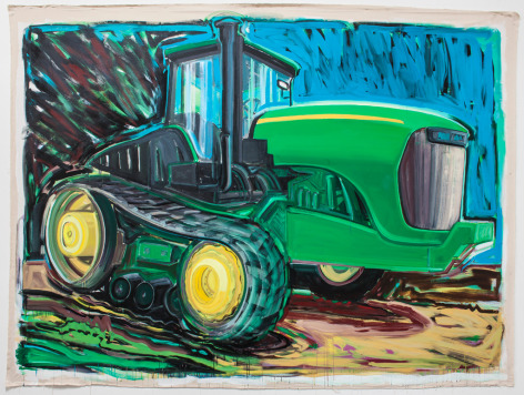
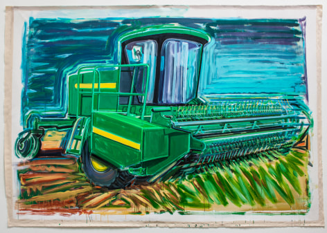
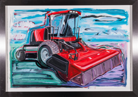
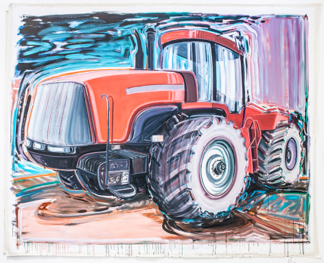
Huge gestural paintings of tractors fill the gallery walls with energy and passion in Karen Carson's latest show. The subjects, mundane machinery usually driven by men, are transformed into brilliant meditations on landscape and culture. Although Los Angeles based, Carson spends ample time in Montana and it is there where she not only takes in the vast landscape but also encounters tractors. To Carson's eye, a tractor is not merely a tractor. It's an imposing vehicle, an economic and cultural reality and something that must be looked up to, the more so when it is painted in basic primary colors.


...
 

ARTILLERY Review: Steven HullFebruary 24, 2016

by Kristen Osborne-Bartucca

Like a modern-day Ishmael, Steven Hull spent the last few years sailing and seeing the watery part of the world. Hull’s enthusiasm for his new hobby unmistakably influenced his current exhibition of painting, sculpture and sound installation at Rosamund Felsen. The nautical and the carnivalesque, two fitting bedfellows in their evocative and lonely surrealism, dialogue with each other in Hull’s work; he contrasts the sense of adventure and whimsy commonly associated with both milieus with the melancholy and anonymity that are perhaps even more pervasive.

...

L.A. TIMES Artist Steven Hull takes a seat at the dark carnival of lifeFebruary 2, 2016

by Christopher Knight

New paintings, sculptures and a group of compelling drawings by Steven Hull are eccentric evocations of the risks, rewards and penalties of going out beyond one’s usual limits.

For his 11th solo show at Rosamund Felsen Gallery, Hull goes out to sea. Anchored by sculptures of a sailboat and battleships loosely reminiscent of Chris Burden’s work, the show also features paintings and drawings on carnival themes. They recall early Modernist images of life as a tragicomic circus of love and loss, stylish dignity struggling with inelegant humiliation.

...

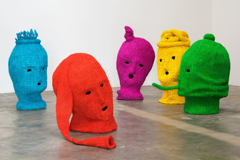
L.A. TIMES Power, feminism and giant, knitted balaclavas: artist Maureen Selwood's Pussy Riot tributeNovember 13, 2016

by Carolina A. Miranda

Los Angeles artist and animator Maureen Selwood watched with the rest of the world as the Russian feminist punk band Pussy Riot became famous for the unauthorized concerts it staged in locations all around Moscow, from a prison garage to Red Square.

After the activist musicians took to the altar of Moscow's Cathedral of Christ the Savior in early 2012 for an impromptu punk jam — with the refrain "Mother of God, drive Putin away!" — some of the band members were convicted of hooliganism and served time in prison. But the video of the young women, decked out in bright dresses, colored tights and a rainbow's worth of balaclavas, prancing maniacally before the Cathedral's gold-leaf altarpiece, turned the band members into global activist-celebrities practically overnight.

...

PATTERN PULP Tuesday's Gallery Picks (Maureen Selwood)October 27, 2015

Inspired by the medieval trial of Joan of Arc, the treason of anti-Nazi activist Sophie Scholl, and the contemporary punk prayer of Pussy Riot, Maureen Selwood’s Sounding the Note of A grapples with the uncompromising feminine. Selwood extols the power of sensuality and thought to transcend violence at Rosamund Felsen Gallery.

KCRW Hunter Drohojowska-PhilpAugust 6, 2015

The Medium is the Message

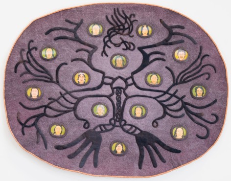
At Rosamund Felsen Gallery adjacent to CB1, dyed and hand-sewn felt pieces by Nancy Jackson incorporate her usual detailed drawings but rendered as small lenticular discs. One represents images of women, with eyes that open and close, embedded in a design that references cosmology. Others are abstract symbology. It is a wonderful show by an eccentric but always interesting artist. Also on view are the unexpected pleasures of paintings by veteran Les Billar. On view through August 8.

...


NewsOK OSU exhibit conjures question: 'Are these tractors sexy?'

By John Bradenburg


STILLWATER — They’re aren’t many subtleties, and that’s a good thing, about the large, loosely gestural acrylic paintings of farm machines in Karen Carson’s “Movers and Shapers: Combines, Tractors and Swathers” exhibit at the Oklahoma State University Museum of Art.

The 13 mural-sized works, which Carson jokingly calls “my big boyfriends,” are in several rooms of the Postal Plaza Gallery at the museum.

The Los Angeles artist presents these gargantuan machines “from a female point of view as humorous portraits of masculine vanity,” a gallery spokesman said.


...

ARTILIKELA Rosamund Felsen Delivers with Kim MacConnel


Moto Okawa


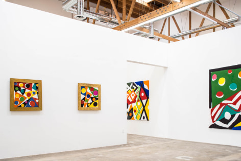
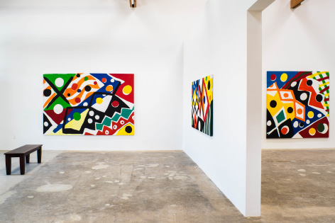
Traveling east from Santa Monica to Downtown Los Angeles, Rosamund Felsen’s new space in the industrial and truck noise-filled Santa Fe neighborhood is beautifully airy. Its much anticipated debut is marked by the bright and bold, decorative abstracted patterns created by the West Coast veteran painter Kim MacConnel. The inaugural moment is an opportunity for the legendary gallerist to once again make her statement and stake her claim in the hip and hopping scene. And she delivers.


...


KCRW Pattern & Decoration Revisited


Hunter Drohojowska-Philp


Rosamund Felsen, who first opened a gallery in 1978, has left her Bergamot Station outpost for the industrial arts zone downtown. It is next door to the new location of CB1, the collector-turned-dealer space of Clyde Beswick, and very near the new location of Cirrus, the gallery of print publisher Jean Milant, who first opened downtown in 1970. An enormous rent increase forced him to move from his 6th and Alameda location with just 30-days notice but he is now in a hub of activity with Night Gallery, Francois Ghebaly Gallery and The Mistake Room within walking distance. A new gallery for the artists collaborative Durden and Ray is across the street. So old-timers join newcomers to add depth and history to the neighborhood. 


...

Visual Art Source Kim MacConnel


Betty Ann Brown


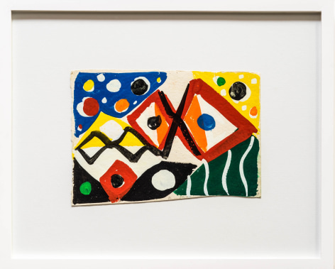
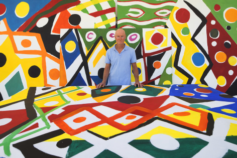
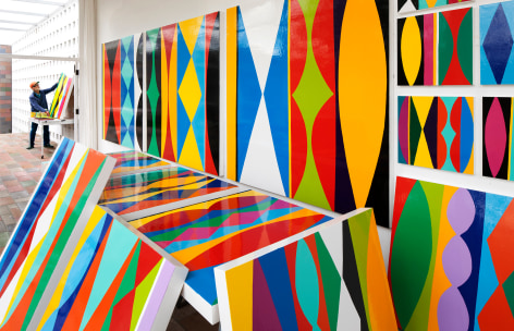
To walk into an exhibition of Kim MacConnel's "Avenida Revolucion" paintings is to find yourself in the middle of a parade down the streets of a Mexican town. Flags flutter, costumes sparkle, music soars, and the world becomes a tsumani of color and motion. The riotous patterns of MacConnel's paintings swirl around in dizzying profusion, animating the walls with brilliant intensity. Orange circles bubble up through blue chevrons; red ribbons undulate through green fields; serpentine lines of white dance across yellow and turquoise. MacConnel uses all of our favorite choices from the crayon box with a playful exuberance that is at once childlike and entirely sophisticated. His deployment of geometry is also knowing: irregular triangles are sprinkled with dots, then scattered across a white field in a practiced dance of form that establishes a graceful equilibrium, rather than a mindless jumble.


...

L.A. Times Why Rosamund Felsen left Santa Monica for downtown's industrial arts district


Carolina A. Miranda


There are a lot of reasons that longtime L.A. gallerist Rosamund Felsen is in love with her new exhibition space in downtown Los Angeles.

There is the light, a soft, filtered glow that pours down from the skylights onto a series of bright abstractions by Encinitas-based Kim MacConnel. There is the continuous rumble of the busy industrial street outside, with its mechanical parade of graffiti-bombed trucks and seafood delivery vans.


...

art ltd. Tim Ebner at Rosamund Felsen Gallery

Jody Zellen

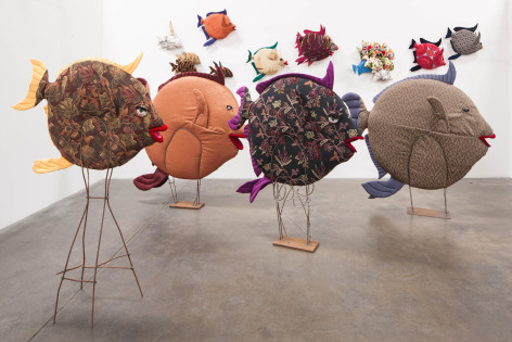
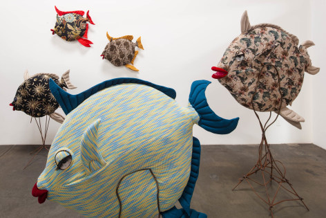
Tim Ebner’s hand-sewn sculptures of schooling fish at Rosamund Felsen Gallery are a delightful feast for the eyes that elicit smiles from all audiences. They also celebrate Ebner’s skills as a craftsman and his ability to excel at whatever medium he uses to create his works. His evolution from hard-edged geometric sculptures to childlike paintings of animals to these playful soft sculptures is the trajectory of a courageous artist who follows his instincts and is unwilling to be pigeonholed. Ebner was a surfer, but is now a fisherman, whose materials and subject matter have shifted to follow his relationship to the sea. The relationship between the surfer or fisherman who travels atop the water looking down or into the sea and the fish that populate that environment informs his process. His early works evoked the surface and materials of surfboards whereas his current work articulates his love and fascination with sea creatures.

...

Fabrik Fresh Faces In Art

Kio Griffith

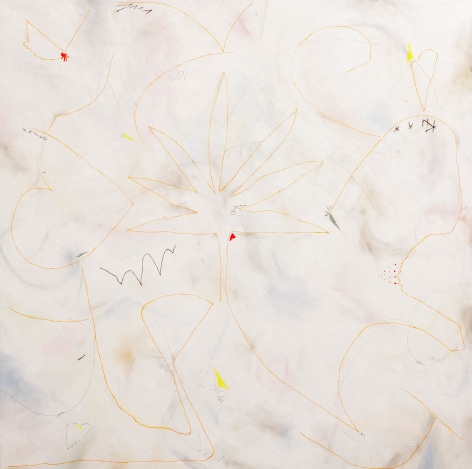
In the meditative balance of figuration and abstraction, John Mills engages mark making with new visual playing fields, an agile order of painted space and the ground it roots itself in. Colorful forms and gestural linework bleed into one another creating compositions of meandering romantic terminuses defying gravity over muted white ground, void but determined.

...

Art Scene Review

Michael Shaw


John Mill's abstractions are light on density; there's typically more white or off-white backgrounf space than foreground imagery. But what initially may come off as faint and/or ineffectual quickly becomes experientially complex.

...

Los Angeles Times John Mills Seems Positively Giddy

David Pagel

New abstractions by John Mills deliver giddy, mischievous fun

Bare-bones efficiency and wondrous luxury mate in John Mills’ new paintings, which are some of the most casual mischief to have come out of Los Angeles in some time. At Rosamund Felsen Gallery in Santa Monica, “High on Signs” fills three rooms and a hallway with 20 paintings that are easy to approach and hard to tear yourself away from.  

...


L.A. Times Fishy installation induces smiles

By David Pagel

Sillyness and sophistication often seem to be incompatible - the former all about unself-conscious fun and latter focused on serious refinement.

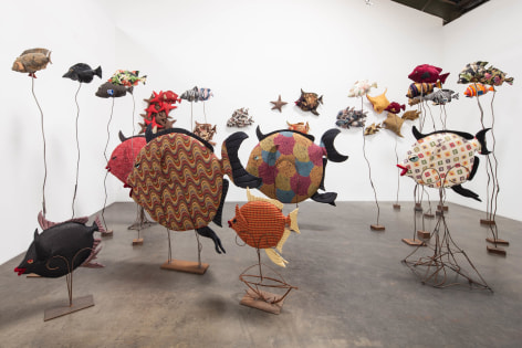
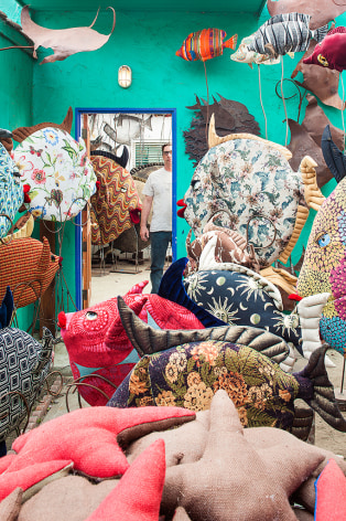
At Rosamund Felsen Gallery, the two fuse beautifully in Tim Ebner's smile-inducing installation of more than 100 fish sculptures the artist has made from elaborately patterned fabrics, sofa stuffing, ceramic eyeballs and welded chunks of rusted metal.

...


The Huffington Post Tim Ebner at Rosamund Felsen Gallery

By Peter Clothier

Rosamund Felsen Gallery has a current exhibition of Tim Ebner’s work. What a treat! For readers in the Los Angeles area, this is one absolutely not to be missed. It’s sheer delight. Click on that Rosamund Felsen link and you’ll immediately see what I mean: there’s an image of Tim Ebner (he looks like he’s having wicked fun!) and the recent work he’s showing at the gallery, where all three spaces are chock-a-block with... fish!

It’s like being under water in some vast, exotic aquarium, with fish of all shapes, sizes and colors swimming all around you.

Ebner’s fish are stitched together out of a mass of colorful patterned materials. The eyes of the larger ones are glossy, hand-made ceramics, and the smaller ones, beady glass. All seem to be staring at the odd-person-out in this magical environment—yourself. Each has its own distinct facial expression and its body language, fierce...

...

ArtScene Tim Ebner at Rosamund Felsen Gallery

By Marlena Donohue

(Rosamund Felsen Gallery, Santa Monice) A Studio preview of Tim Ebner's newest work offered the luxury and joyw of seeing the current show in the context of the artist's entire, diverse career arc. Ebner's new installation features "school" of 4-to5-foot fabric fish "floating" at about eye level in sprialing metal armatures (Sculptures in their own right), plus clusters of smaller fish suspended atop thin metal rods tall enough to hover overhead.

...

ARTICULATED ARTISTS John Mills talked to Alli Sharma at Weekend Gallery in Los Angeles


AS: When I look at your paintings I imagine some of the marks are made from felt tip pens, is that something you use in your drawings?

JM: Most of my paintings are based on prior ink drawings. For a long time I used black ink on paper, then I discovered coloured markers and that opened up the process because then I could start drawing with colour as a means to create composition and think about how shapes and colours interact on the initial drawing surface. It was a revelation, but I have been doing this now for a long time. So the painted marks reference prior marks that I made in a drawing process. Sometimes they’re mediated to appear almost precisely how they were originally in the drawing and sometimes I allow the paint to be thicker or barely there at all. I diverge from that script often by using the tactility of the paint, how paint behaves differently to ink.

...

Artillery Karen Carson by Eve Wood

by Eve Wood


Karen Carson has a tremendous sense of humor, as is evidenced in her most recent exhibition at Rosamund Felsen. Having chosen farming equipment—most prominently, tractors—as her subject matter, Carson revels in the sheer monumentality and vibrant colors of these exquisite forms. Whoever would have thought tractors could be so compelling?


..

L.A. Times Karen Carson gives farming sex appeal at Rosamund Felsen

by David Pagel


By the time Monet got around to painting pictures of haystacks, viewers pretty much knew that his works were not about farming.

All kinds of subjects, including perception, time, workmanship and mortality, as well as paint’s capacity to make and convey meaning, played into the Impressionist’s images of life in the French countryside.

Times have changed — and not for the better.


...

ARTILLERY Steven Hull at Rosamund Felsen GalleryOctober 2013

by Eve Wood

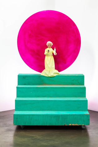
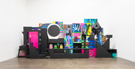
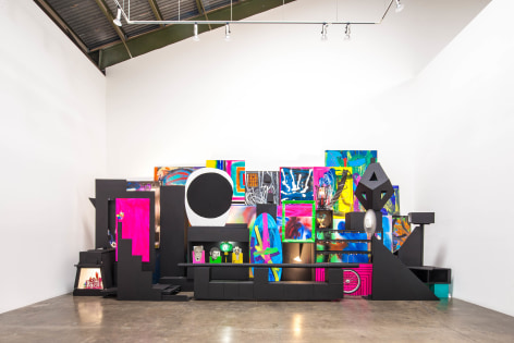
The inside of Steven Hull’s brain could be likened to a flowering tree in constant bloom. His newest effort, “Balcony,” is an exploration into the various ways that meaning is extrapolated from any artwork, or for that matter any “thing” in the living known world. Hull’s sculptural installations are riotously inventive and seemingly hell-bent on exploding open any preconceived ideas we might have as to what art is capable of in its purest form. Works like the enigmatic, and strangely menacing “Grandma” has a shamanistic appeal, though this grandma could also have sprung fully formed from the mind of Stephen King, standing on green stairs in front of a glowing pink disk and holding a wayward eyeball. My, my, Grandma what big eyes you have indeed!

ARTSCENE Review: Steven HullOctober 2013

by Jody Zellen

Steven Hull has fun making art. His works are playful installations with miniature steam engines and marionettes. Fans spin and colorful panels are stacked against the wall. The abstract and representational, real and imagined mingle within room-sized installations. He uses the walls as framing devices and allows his “paint- ings” to extend into the space so that they become sculptures and paintings simultaneously. While the narrative thread through the work may be obtuse, it is clear that Hull’s placement is not arbitrary; he is interested in how the parts add up to create the whole. In this installation he has collaborated with the Bob Baker Marionette Theater, bringing puppets into the mix in order to add another layer of interactivity to the work.

L.A. TIMES Parties Gleefully Crashed (Steven Hull)September 13, 2013

by Christopher Knight

Steven Hull has done many projects that cross boundaries typically drawn among artists from various disciplines, including writers, musicians, illustrators and performers, as well as within disciplines like painting and sculpture. A new, psychologically prickly body of work brings marionettes into the delirious mix.

Hull titles the show “Balcony,” the term for a gallery found in a theater. At Rosamund Felsen, 10 tableaux mix abstract paintings, both gestural and geometric, with assorted masks and figures.

One room also includes vintage marionettes loaned for the occasion from the Bob Baker Archive – a bony skeleton, a baggy clown, an anthropomorphic flower and more. The art gallery is unveiled as a puppet theater, a public stage for surrogate emotion and substitute activity.

...

ART LTD. Critic's Picks: Los Angeles (Steven Hull)September/October 2013

by Eve Wood

For decades Steven Hull's work has been marked by a riotous comic sensibility, as though life itself were a meditation on the absurd; yet beneath the exacting wit and garish colors, one can clearly discern a passionate and committed mind at work. Hull has long been a "multi-faceted practitioner and curatorial figure" on the Los Angeles art scene and has been exhibiting at Rosamund Felsen since 1998. His projects are diverse and far-reaching and include long-term collaborations with other artists, musicians and writers,  his own practice as an artist seemingly  intensified by his interest  in and support of other artist's efforts. In 2010, Hull co-founded Las Cienegas Projects with a curatorial program that focuses mostly on more esoteric work and community participation.

...

ArtScene Diane CalderApril, 2013


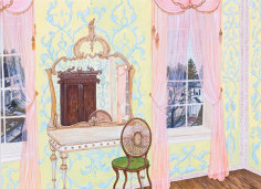
Nancy Jackson sets the stage for our journey out of the ordinary with “Interior,” a modestly sized gouache and ink work on paper. Displayed on the entry wall of the gallery, it establishes the muted pastel pallette and passion for ornamentation that instantly informs us that we are “not in Minimalism anymore.” Those familiar with the work of Florine Stettheimer, an introspective early 20th century artist best remembered for the innovative cellophane and lace sets she designed for the 1934 operatic production of “Four Saints in Three Acts,” may discern echoes of her concerns in Jackson’s output. Both New York-based women - if separated by time - effectively incorporate references to transparency and luminescence into their art, suggested metaphorically here in the diaphanous drapes that frame the windows of Jackson’s “Interior” and the slightly off center reflections she captures in her ornate vanity mirror. 


Jackson’s “Paraportal (Photo-Op)” invites viewers to center themselves under a delicately colored, conscientiously constructed, ornamental cut paper construction that serves as a framing device. After realizing that each viewer's own image appears relatively small when the totality of “Paraportal (Photo-Op)” is present in their camera’s view finder, visitors may conclude that, like Alice complying with instructions to “Eat Me,” they can grow their size relative to the artwork simply by stepping out into the room, away from the wall and closer to the camera.


When visitors have their backs to “Paraportal (Photo-Op),” the ceramic elements laced together in “Space Lace #1-9,” hung sky high on the opposite wall, are most clearly visible. Jackson wears a necklace similar to elements in the wall hanging, reinforcing her shaman-like appearance in Grant Mudford’s insightful photo portrait, featured on the gallery’s invitation to this show. Next to the artist, enthroned on a mountain of pillows, is “Blue Tree,” an enchanting assembly of intricate jewel-like elements that is a worthy tribute to Jackson’s complex sensitivity to color, texture, pattern and form, and most likely a coincidental acknowledgement of Stettheimer’s posthumously published book of poetry, “Crystal Flowers.”


Also amazing on an intimate scale, are the four works in Jackson’s “Cozy Bubble” series, featuring doll sized beds centered in protective shell-like frames, with a variety of interiors designed to provoke delightful dreams. On the opposite end of the size scale, elements composing Jackson’s wooly installation “Shagman,” evoke an evening of carnival fun, intermixed with Mike Kelley’s incredulity. Even though “Streetsweeper 1” and its twin, equipped with brushes that serve as tails, add touches of frivolity, a disconcerting element clings to this work.


The scene-stealers in this show tend to be the intricate, multi-media sculptural pieces exquisitely fabricated by Jackson. But those who pay less attention to the half dozen paintings Jackson positions throughout the galley, performing like poetic chapter headings and sign posts, may miss subtle innuendoes embedded in the artist’s work. The most autobiographical of Jackson’s flat, framed creations may be “Blue Bubble,” a collage constructed out of gouache, pastel, watercolor, and thread on paper. In it we see a figure resembling the artist strolling nonchalantly on an embossed, biomorphic sky blue platform of her own creation, orbiting above the curved surface of the earth. Carefully observed, this painted work and other fantasies created by this intuitive artist compel us to take time to dream, adjusting our perspective to fully examine each work we encounter in her enchanted world of possibilities with a sense of wonder before continuing down the path towards the next adventure Jackson has in store for us.


(Rosamund Felsen Gallery, Santa Monica)

Visual Art Source Kim MacConnel12/2012


Michael Shaw 


Take one look at the announcement photo for Kim MacConnel's sixth solo show here and you'll know you're in for a riot of color. But not one without structure; MacConnel employs an approach that is equal parts systems and intuition. Each panel is divided into three or four columns, or vertical panes, within which slightly irregular triangles, parallelograms, half-ovals, and the like face off with their respective borders, whether negative and/or positive space. Given suggestive but ultimately minimalist titles such as "Bunny," "Rabbit," or "Dove," his latest bodies of work – including a mural-sized, multi-panel piece that was included in his retrospective "Collection Applied Design," at the Museum of Contemporary Art San Diego (October, 2010 to January, 2011) – have ditched acrylic on canvas in favor of enamel on wood. Are they more finite? Probably. Sexier? Definitely (or maybe it's the other way around). MacConnel has never been shy about wielding palettes of unadulterated primary and secondary colors, though typically he balances in just enough sections of black and/or white to give one's eyes room to breathe; still, they're far from sedated.


...

art ltd. Karen Carson: "La Condition Humaine" at Rosamund Felsen Gallery

By Jody Zellen

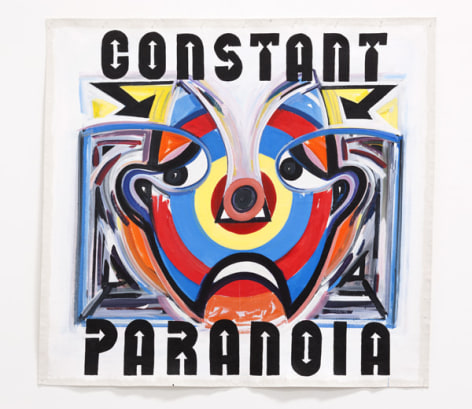
In "La Condition Humaine" Karen Carson pushes the conceptual boundaries of image/text juxtaposition by offering large banner-like paintings with kitschy type situated above and below loosely rendered yet enigmatic faces. In these works, she combines the gesticulation of an expressionistic application of paint with the funkiness of circus banner typography and the verbal acuity of advertising slogans. The 26 un-stretched works on canvas are push-pinned to the walls. Each work boldly asserts a two-word pairing that at first glance seems obvious, but upon meditation, especially in relation to Carson's images, resonates on multiple levels.

...

Art In America Annie BuckleyNovember 16, 2010


Nancy Jackson’s latest exhibition, her sixth with Rosamund Felsen Gallery, was a lighthearted tour de force consisting of seven paper mobiles, at once intricate and majestic, nine works on paper and 12 sculptures. The keen balance of intellect and intuition Jackson has displayed in prior exhibitions was here injected with levity and wisdom, revealing another facet of an artist adept at using fantastic imagery and meticulous processes to probe psychological mysteries and metaphysical dramas.

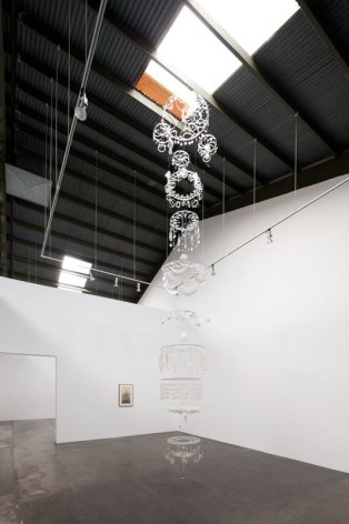
Untitled (Large mobile), 2010, is 22 feet high, and it stretched from ceiling to floor. The all-white work is made of plastic rings strung together with thread, one above the other, each hung with cut-paper shapes, thousands in all—curlicues, discs, moons, arrows and the like, all in rhythmic patterns. Peeking out from the bottom is a solid glass object; shaped like an upside-down exclamation point and surrounded by a fluff of monofilament, it resembles a sea creature and exudes a playful sexuality. In the same room was a small gouache and ink on paper, The Way it Works (2009), in which a lush plant, its juicy green leaves and delicate pink tendrils bursting from a thick stalk, erupts from a mountain of human skeletons. The undulating shape of the plant mirrors that of the mobile, and their actions are reciprocal—one descending gracefully, the other reaching energetically up.

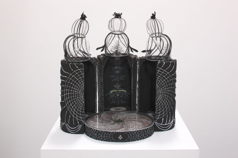
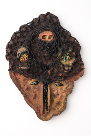
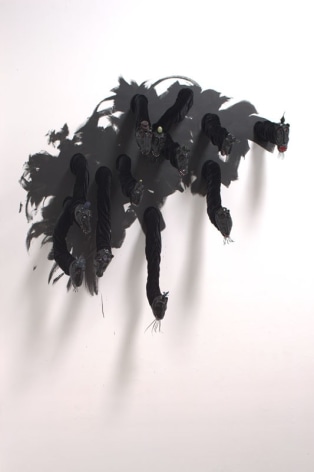
Six equally elaborate mobiles, each about a quarter the size of the large one, occupied a second room, along with a wall sculpture, Untitled Heads 1-11 (2010). In the latter, 11 shiny black papier-mâché-and-clay masks sit in the end of springy velvet-covered tubes that stretch into the room like serpents. Each face, about a foot high, sports a set of pointy white teeth, a bright red mouth and a quirky hat. In the context of the artist’s interest in psychology and dreams, the creatures connote anxieties and neuroses, yet their grins suggest mischief. The area of the wall on which the heads were installed was painted in broad swaths of matte black; the immediacy of the brushstrokes struck a balance with the labored intensity of the mobiles.

The dreamlike narratives of the paintings and drawings in another room have a darker sensibility but retain seeds of optimism. In one four-part ink-on-paper drawing (each sheet letter-size), a turbaned woman snatches a glowing crystal from a stand, only to have it grow back during her getaway. The storyboardlike sequence suggests a parable about a benevolent light. In a small gouache on rice paper, Untitled (NY), 2010, a detailed depiction of an urban street, a torrent of yellow, blue and white lines seems to have replaced the buildings. Is the city being blessed or destroyed? It depends on one’s perspective, but the rest of the exhibition—with the patient process inherent in the hand-cut mobiles and the playful absurdity of the heads—tips the reading toward the benign over the apocalyptic.

Image: Nancy Jackson: Untitled Heads 1-11, 2010, enamel, papier-mâché, aluminum tubing and mixed mediums, 80 by 87 by 21 inches; photographed by Grant Mudford, courtesy of Rosamund Felsen Gallery.

Los Angeles Times Leah OllmanSeptember 17, 2010


A Tonic Against the Inauthentic


Responding to the sense of alienation in art that she felt had been fostered by modernism, historian and critic Suzi Gablik made a case for “The Reenchantment of Art” in her book by that title, published in 1991. She called for a renewal of art’s social responsibility and moral purpose, a reconnection with its roots in myth and archetype. Though Gablik voiced her concerns about the soulless state of art nearly two decades ago, that despair is just as easily invoked by much of the insular, over-schooled and hyper-strategic work that fills galleries today.

Which is why Nancy Jackson’s new work at Rosamund Felsen Gallery feels so restorative, so truly enchanting. Jackson’s show, as ever, is an event for the spirit, invigorating in its authenticity. A group of mobiles, all-white, floor-to-ceiling cascading rings, dangling dots, loops and fringe, is breathtaking, both blatantly festive and quietly sublime. Made of paper, Styrofoam, aluminum, polymer clay, thread, monofilament and glass, they hint at the mystical and also the musical, while testifying to the fundamental human impulse toward ornamentation.


In one room, six of the mobiles are offset by a group of shiny black, vaguely animal heads on tubular, velvet necks protruding from a painted dark patch on one wall. Comic and grotesque, with sly smiles and ridiculous hats, the pack looks slightly crazed, as if malevolent forces were intruding upon the sanctity of those ethereal, gently twirling white confections, sullying the innocence and purity of the assembly, and playing out a primal conflict between light and darkness. Jackson’s ink and gouache drawings, too, often set beauty against death. Strange, fantastic and darkly funny, they affirm Jackson’s commitment to an art of exquisite craft, complex beauty and a deeply human sense of fear and wonder.

Work Study Eowyn WilcoxSeptember 23, 2010


The Fantastical and the Real

Nancy Jackson's work embodies the fantastical, but in her most recent show I wasn't thinking in any way of modern fairytales which skip the difficult parts of life, but of old, ancient fairytales, the kind that A.S. Byatt talks about in The Children's Book as being dangerous.  The kind of fairytales the Grimm brothers collected, and that most parents won't read to their children because fairytales like these are really meant for adults.

And at the same time, Nancy Jackson's work also reminds me of Emily Dickinson's poetry, because it is fierce, lonely, and exultant in its loneliness.  All through her show I was amazed by the sense that I had never seen anything like this before, and that all this was sincere, real, the inner workings of not just any artist's dreamlife, but Nancy Jackson's particular and peculiar dreamlife, laid out with absolute honesty.  Her cat-masks with their long whiskered chins were scary without being frightening, friendly but also sinister and dangerous.  I had the sense, which occurs in the very best fairytales, the ones most sublime and at the same time most true to life, that I was fully enwrapped in her world, discovering that the mobiles spin at different rates when you move by them or breathe on them with some of the reflected power the artist must have felt at the same discovery.  And on such a scale!  Twenty-two feet from floor to ceiling, trailing whiskers and threads and white flower blossoms, and all without ever tipping out of the poetic intensity of the dream. 

My favorite pieces in the show (along with the cat-masks) were the drawings, which were a revelation.  They reminded me of Ensor's drawings in their intricacy, loneliness, and also in the scale and style of the work, but without his note of perversion.  The skeletons in the drawings, the autumnal themes brought a note of death into the show which was deeply moving, and appropriate.  It reminded me of what I was thinking about with the skull in Braque's studio---that all artists, to some extent or another, are making art to postpone their death, or to live on beyond death (to not be forgotten)---that they are, in fact, making art for or against death, in preparation for its coming.  Death is an undercurrent in all art, just because it is either passing quicker than we are if the materials are ephemeral, or because we know it will last long after we die, if the materials are lasting.  And at a deep level, art is a way that thought lives on even after the flesh decays.  And I have to admit that the skeletons felt like something out of my dreams, because I used to dream often about skeletons throughout my childhood and adolescence.  But I digress.

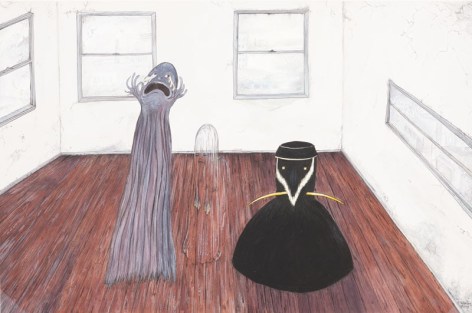
The Threesome gave me the thrill of the cat-faces again, in that it was something the likes of which I had never seen, and in which I instantly and implicitly believed.  There was something about the emptiness of the room, the blurry city outside the windows, and the way the three ghosts seemed to describe three parts of the same process of disappearing: tears welling up on the left, invisibility in the middle, rock-like stoicism on the right.

What both artists reminded me of, and which I am grateful to both of them for, and which most great art makes me feel, is the sense that even though art is the most refined fantasy, still it teaches us deeply of the real, that it is in fact, deeply real, life distilled and intensified in an object or image.

ArtScene Jody ZellenSeptember, 2010


Nancy Jackson's current show splinters in two directions. In her narrative works on paper, detailed drawings and paintings come off as quirky, cutting and humorous. The surprise, however is the multi-part mobiles that hang from the ceiling in the main gallery. White cutouts of flowery, geometric and ornate shapes dangle from one another, spanning the distance from floor to ceiling. These obsessively fantastical and intricate works are both seductive and charming. Each piece resembles a chain of an ornate chandelier (made from light materials) that has been taken apart, stripped of the original context, and fashioned together to become more than the sum of its parts (Rosamund Felsen Gallery, Santa Monica).
 

L.A. Weekly The Power of Negative Thinking

by Doug Harvey

One artist who manages a remarkable tightrope balance with many levels of negativity — while always managing to surprise — is painter Karen Carson, whose work has ranged from minimalist geometric fabric "paintings" (with zippers allowing reconfiguration) to baroque, mirror-studded, cobbled-together architectonic abstract explosions; shaped-canvas cubist bouquets of decorative-clock flowers or stealth-bomber/vulture hybrids; vinyl banners combining Las Vegas gaming design with stripped-down Buddhist aphorisms; and backlit bar-style light boxes depicting raging forest fires. Her latest body of work continues her recent exploration of strategies like rectangular surfaces covered entirely with paint, constituting an image of a landscape. For Carson, that's pretty far out.

...

Los Angeles Times David PagelJuly 4, 2008


There's no glamour, just deep themes


Intimacy is Nancy Jackson's forte. Each of her seven diorama-scaled sculptures and page-size drawings in another room at the gallery creates such a convincing little world of its own that it's easy to forget yourself in its presence -- not to mention where you're standing and everything else around you.

Jackson's meticulously rendered gouaches are all about contemplative solitude, of following one's own path and meandering through out-of-the-way places. "Crossroads," "Hard Rot" and "Bird Mountain" suggest that difficulty, luck and humility may lead to self-knowledge, but only if the self doesn't get in the way.

The two best pieces are the most elaborate. "Ka" is a wall sculpture that mimics the format of a ceremonial mask but also embraces the nestled complexity of multiple realities, its eyes and mouth opening onto worlds-within-worlds.

The only free-standing sculpture, "Oum," is more than 6 feet tall. But it is made of such fragile materials -- string, wire, clay and porcelain -- that it doesn't tower over viewers, but rather seems to be the model of a solar system inspired by dangling earrings and delicate chandeliers.

As a group, Jackson's low-tech, handcrafted works engage viewers -- and the world around them -- by making room for respite.

Los Angeles Times David PagelJanuary 11, 2008
AROUND THE GALLERIES


Realism, with a dose of whimsy

January 11, 2008|David Pagel

Karen Liebowitz's paintings of pretty women mending fishing nets, riding leviathans and blowing up inflatable pool toys blend classical mythology and pop culture in an ambitious mixture of fantasy-fueled Realism. The combo is loaded: provocative, promising and pointed, yet a bit too pedestrian to get viewers to suspend disbelief and abandon themselves to the pleasures of these beautifully painted pictures.

Two gigantic oils on canvas anchor Leibowitz's exhibition at the Rosamund Felsen Gallery. The first features five bikini-clad babes perched in a sea cave, where they repair rips in an old-fashioned fish net. Bright sunlight pours in the heart-shaped mouth of the cave, bathing their bodies in a warm, sexy glow. Each appears to be lost in her own thoughts, like Penelope unraveling her daily weaving while she longs for Odysseus, or a world-weary twentysomething waiting for the sun to set and the clubs to open.

The second image depicts a young woman in a red negligee and black bra sitting on a barnacle-encrusted rock as the frothy surf licks her toes. A lightning storm blows in from the horizon as she parts her lips, closes her eyes, tips her head back and prepares to blow a lungful of air into an inflatable toy.

The toy is the best thing in the painting. At one end, it's a lump of crumped silver-blue plastic, gripped tightly by the light-headed heroine, who just might be in ecstasy. Its other end is a sea monster's tumescent tentacle, covered with rosy orifices and extending beyond the image's edges to suggest a beast as big as anything Jules Verne envisioned. Between the two ends, Leibowitz handles the transformation from inanimate object to monstrous mollusk with aplomb, using glistening, viscous pigments to bring fantasy to life in ways that are at once seductive and scary.

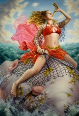
Two sofa-size paintings show the creature in action. In one, a surf chick dressed like a mod belly dancer blows a ram's horn as she rides the beast with the confidence of a rodeo champ. In the other, she hangs on for dear life, no match for the imaginary animal's awesome power. In both, the monster steals the show, its purplish hide pocked with flowery suction cups and dripping bits of golden kelp.

Thirty small studies -- in charcoal, watercolor or oil on panel -- reveal various stages of Liebowitz's process: tightening compositions, trying out different settings and refining the figures' postures, gestures and expressions. All lead to the four big paintings, where the 32-year-old artist has room to strut the stuff she does best.

It involves an ethos of earnest workmanship -- or painstaking craftsmanship -- married to a sense of campy preposterousness. Think Margaret Nielsen meets Carlo Maria Mariani. Or John Currin without the breathless reverence. Or Lisa Yuskavage with greater emotional range. Or Rebecca Campbell without the ambiguity.

Leibowitz has not worked out all the kinks in her attempt to make paintings that are heroic and both timely and lasting. But she shows herself to be a painter worth watching, an artist unafraid to take big risks and with the talent to meet them.